Embracing Darker Tones in Our Homes
By Neil Johnson, Principal – Creative, U31 Design
Inevitably, there comes a time, after years of living in the same home, that people decide it’s time for a change. Not just a fresh coat of paint or a few new pieces of furniture, but truly transforming their decor. Most of us live with light neutral tones and introduce hints of colour with art or cushions, and truth be told, this approach can be quite beautiful. But how do you arrive at a design scheme that’s not so run-of-the-mill? One suggestion would be to go dark. Yes, I know you’re afraid it will be dingy or depressing, or it will make the space feel small, but keep an open mind. Introducing darker tones, whether deep charcoals or browns, or even a rich sapphire blue, can actually create a warm, comforting and dynamic space.
Recently, I designed a home in North Toronto that featured traditional architectural elements — panelled walls, heavy mouldings, beam vaulted ceilings — and in consulting with my client, we decided to contemporize the home while paying homage to the beauty of the traditional detailing. To that end, I decided that the best way to do this was to incorporate deeper backgrounds. Of course, achieving this is not just a matter of going all out with black paint; it’s a matter of choosing the right spaces, creating balance between dark and light, and pairing the right elements to build upon.
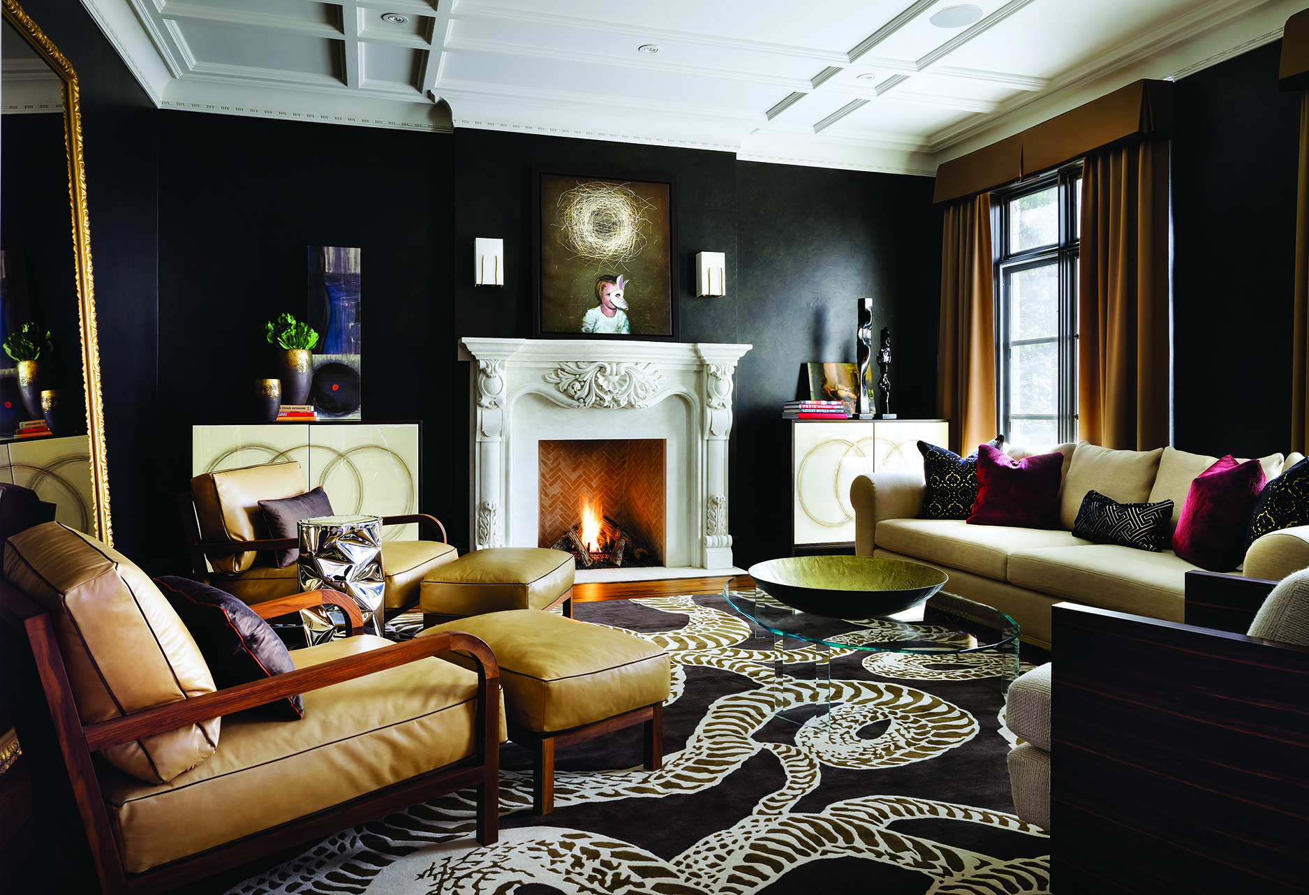
In this residence, the living room walls are done in a smooth black plaster finish. In so doing, the existing ornate fireplace, done in a light textured stone, becomes the focal point, holding court with the other furniture pieces in the space. The furnishings, all with clean lines finished in lighter to mid-toned textiles, provide a sculptural outline against the dark backdrop. This outlining or contrast makes one acutely aware of the area around each piece, which helps animate the space and makes the room feel larger. The dark walls can do the same for art, either emphasizing the bold colour of a canvas or highlighting the delicacy of fine line drawings on paper.
As with all spaces, lighting is extremely important, especially when working with a darker palette. I encourage people to use multiple light sources including wall sconces, table lamps and ceiling lighting to make the room glow. The eye doesn’t want to focus on any one light source; the room wants to feel as if it emanates light. Further to this point, I’d also recommend introducing finishes such as mirrors and metals that help reflect light. In this living room, we used an over-scale leaning mirror with traditional gilt frame, sculptural polished steel side tables and a glass coffee table, all of which help to reflect light and maintain a balance with the surroundings. Even the wall finish, though dark, has a subtle sheen to give it depth and play with light.
In the powder room, we took a dark feature — the modern vanity — and set it against a light backdrop. This high contrast creates a strong graphic visual that maintains rich warmth. Furthermore, painting the ceiling dark not only helped to make it disappear, but made the ceiling fixture with its multiple small globe-like bulbs appear as though they were floating in midair. To help focus attention to the modern floating vanity, three of the four walls were covered in a textured, chocolate brown wall covering, and the feature wall was clad in a light marble which allows the dark brown marble and bronze metal vanity to command attention.
It’s important to note that not every space in this home was finished in dark tones. The foyer, stair hall and corridors were all kept quite light to maintain balance. As one exits a darker space, they enter a lighter one. This creates a link between the lighter elements within the darker spaces, and in so doing, establishes a common thread that pulls the design together. In this vein, one travels from the breakfast room, lined in chocolate brown cork wallpaper — note the white marble table top which becomes the focal point — to the great room which becomes a much more tonal statement, pulling in elements of the dark and light, focusing on the mid-tones: a light caramel paint, mid-tone stained oak, acid etched bronze mirror and a graphic carpet which animates and lightens the room, again creating a link between all the spaces.
I think we are definitely seeing a resurgence of stronger jewel tones and this move towards higher contrast. For those wanting to try this approach but perhaps feeling hesitant about it, I’d suggest choosing a central space that can be seen from various locations in the home. Let’s say you choose a dining room. Think about treating the wall with a bold deep tone and then pulling that colouring or tonality through the rest of your home with furniture pieces, art and carpets. This will help link the spaces and create a consistent story throughout.
Embracing darker tones in our homes can also be beneficial from a sense of well-being as we live in a climate that’s cold for so many months of the year. Think of yourself slogging through snow and cold, but knowing that once you step into your home, you’re enveloped by the deep warmth of your surroundings. It’s cozy to unwind in the comfort of a cocooning space… just picture the traditional wood panelled library from times past.
To be clear, I would never suggest that going dark is the right choice for every space or client. My job as an interior designer is to present options and different solutions that fit each client’s lifestyle. But, if you want a welcoming, warm space, and one that doesn’t necessarily follow our conventional thinking, open your mind to possibilities… and don’t be afraid of the dark.
BIO
Neil Jonsohn is the head of the residential division at U31 Design and has 17 years experience in design and project management of luxury homes. He’s worked throughout North America and the Caribbean and his projects have been recognized by various publications and prestigious interior design associations.

