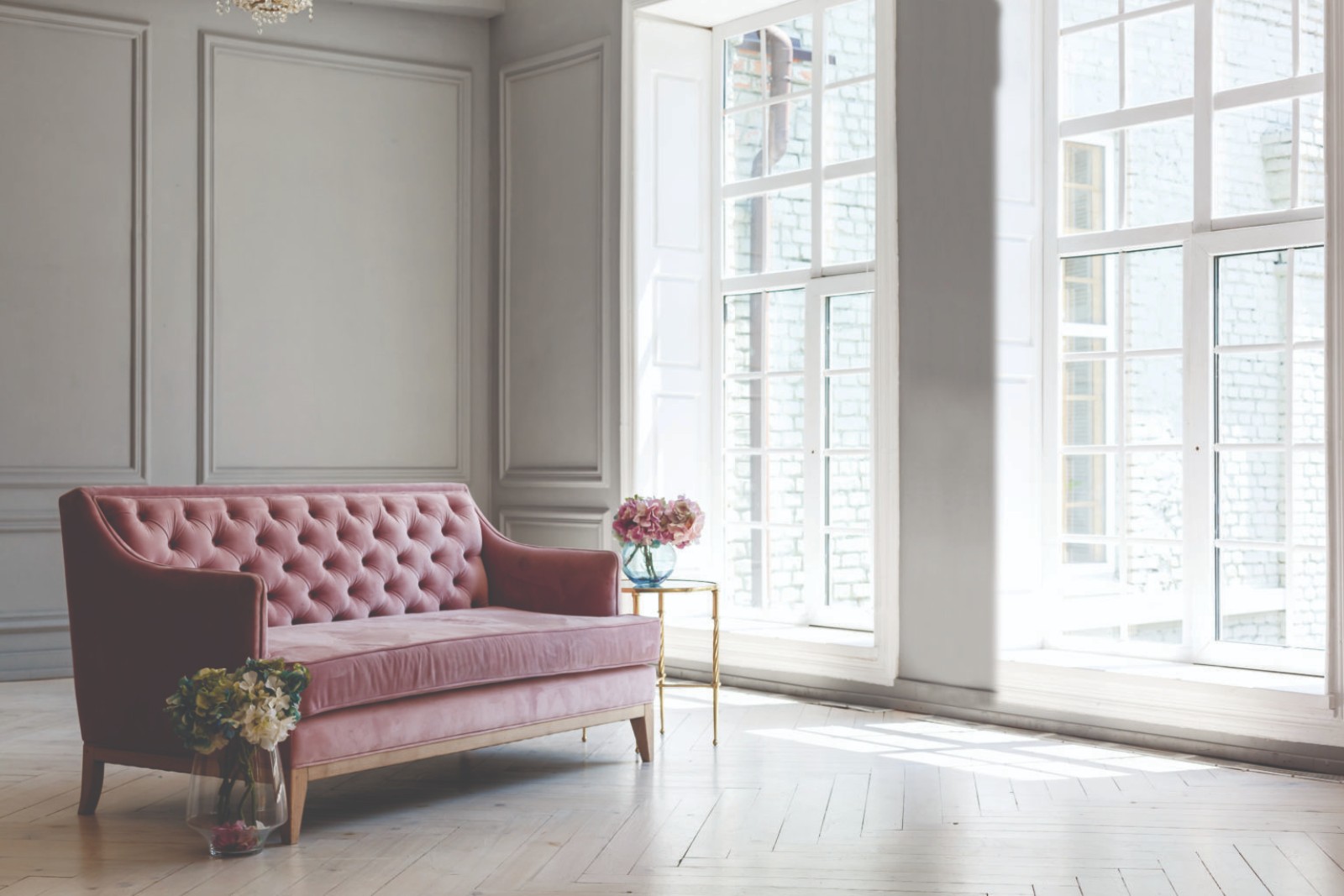
As we enter a new decade, it may be time to reconsider arguably the hottest neutral of the 2010s — greige.
by Luxury Portfolio International
How did greige come to be a go-to trend in the first place? Two popular colours preluded this pick — beige and grey. “Beige had been a long-time, go-to neutral which started to grow tired, so grey became a refreshing palette,” says Dee Frazier, CEO and Principal Designer of the award-winning Dee Frazier Interiors in Plano, Texas.
Frazier states that grey, too, has been popular for a long time, recalling that she has incorporated it in her designs as far back as the 1980s. “The problem with grey, however, is that it tends to be cold,” she says, and while people tend to enjoy warm colours, like beige, it needed to be made contemporary. “That’s where greige came along. It’s the best of the both worlds. It’s a fresh take on the grey family, but it has a warmer feel to it.” Homeowners enjoy greige because it acts as a blank canvas, complementing whatever colour schemes it’s paired with, whereas non-neutrals act as a statement that has to be thoughtfully planned around.
The idea of the blank canvas also makes sense when someone is looking to sell a home — risky colours may put off a buyer, whereas a contemporary neutral like greige is non-distracting and instead provides buyers the opportunity to envision themselves living there. As a result, it’s no wonder that greige has taken over — it offers all the benefits of a neutral palette that is both contemporary and stylish. That being said, its long-reigning popularity means the shade is everywhere and, with that, is bound to come some fatigue. “Some people are growing tired of it, but that happened with beige, too,” notes Frazier. The hue’s overexposure has also notably meant that perspective properties have taken on similar colour schemes and, while beautiful, can appear too similar. As a result, those with greige walls may fail to stand out.

Alternatives to Greige
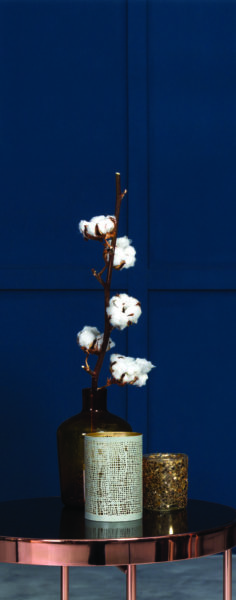
Those looking to make a memorable impression may want to consider incorporating bolder, non-neutral colours on the wall — blue, for example, is what Frazier recommends for those looking to sell. “Blue is timeless — people love blue,” describes Frazier, noting that it’s a popular pick among her clients in Texas. In fact, “Classic Blue” was named Pantone’s Colour of the Year in 2020. Pantone described it as “instilling calm, confidence, and connection,” and that it “highlights our desire for a dependable and stable foundation on which to build as we cross the threshold into a new era.”
These words, written in late 2019, feel particularly poignant with the uncertainty brought on by COVID-19, making “Classic Blue” an even more desirable pick when preparing your home for market. The beauty of blue, too, is there is a shade for anyone, according to Frazier — one could lean towards the indigos and dark blues, or instead opt for a blue-green hue, like teal or turquoise. She continues that green, in and of itself, also makes for a great pick, particularly an emerald green. Alternatively, olive green works exceptionally for those still looking for warmer undertones. Frazier cautions, however, to be wary of greens that are “too yellow, too bright, or too 1980s.”
Homeowners may also consider looking into trending and upcoming colours, however, it’s necessary to avoid colours that frighten people, Frazier notes, recalling a home she previously worked on that didn’t sell for three years due to its colour scheme. After changing the palette, the home sold within two weeks. “Your house has to be personable in a way that buyers can envision themselves living there.” For those who prefer to stick with neutrals, it’s important to remember the two types of neutrals — browns, which includes beige, and the shades between white and black, which would include greige and grey, says Frazier. If you’re looking for warmth in your neutrals, consider the “new beiges,” which are less yellow than those previously popular, or perhaps a cream with warmer undertones.

Neutrals can even be bold. Striking contrasts of black and white make just as much of a statement as non-neutral colors. Frazier describes an exceptional dining room she did with black wallpaper and a matte black ceiling, which was then contrasted with white woodwork and white crown molding. She completed the design by adorning the room with splashes of fuchsia, orange and purple.
Make a Greige Room Stand Out
If you’re still committed to greige, find other ways to make your rooms stand out. Essentially, greige walls should act as a backdrop for the other design elements of the room. Frazier says in this case, “the house is greige, but what you see is everything around it, pulling the design together.” To accomplish this, she advises incorporating colour in the artwork, décor, wallpaper and other accents.
When working with colour, it’s important to ask yourself, “What’s our neutral base? What’s the first colour we’d like to add in after that?” Frazier then expands that once you’ve established the neutral base and the non-neutral you’re looking to bring in, it’s time to determine the palette’s remaining complementary colours. Colours that are opposites on the colour wheel are very strong together, whereas neighbouring colours quietly balance each other out. For example, a striking match with blue is rust, because of rust’s orange tones, whereas blue with violet or green will create a calmer mood. Ultimately, the direction you’ll go with your design will depend on preference.
Greige is understandably a popular colour choice, however, the momentum is waning. Love greige? Go for it, but play with colour and texture to make the room pop. Looking for something refreshing? Consider a “new beige” or classic colours. Whatever the pick, make sure it feels right for you.
LISTED LOCALLY. MARKETED GLOBALLY.
Harvey Kalles Real Estate is the Toronto-based affiliate of Luxury Portfolio International. For more information Luxury Portfolio International and our other global affiliates, click here.

