By Kimberley Seldon, Originally published in COLLECTIONS by Harvey Kalles Real Estate Ltd., Brokerage
Increasingly, consumers are asking interior design professionals for a more personalized approach to decorating. Homeowners want finished rooms that feel custom designed and that incorporate colours with personality, rather than a ‘straight from the box’ beige.
While neutrals like beige, gray and white are perennially pleasing; their subtleties can leave spaces feeling austere. With that in mind, the addition of one or more accent colours will energize the neutral base and create interest and personality.
Are you ready for a fresh look? If so, consider the role colour plays in creating the magazine worthy rooms you love. Here’s a look at six rooms that started with a neutral base and were infused with colourful style.
Plum and Peacock
Recently I enjoyed working with a young family who moved into their dream home in an elegant Toronto neighbourhood. The bones of the house are sublime: large windows, gracious rooms, gleaming wood floors. Although it’s a family home, the clients envisioned a living room that was both elegant and colourful.
A dominant palette of pale silver on the walls, complemented with white trim, highlights the room’s scale and architecture. A decorative artist striped the walls in faint oyster and gray tones, subtly contrasting the silver and charcoal patterned draperies. Then, we used a one-two punch of plum and peacock to enliven the setting. Although the strongest colours are limited to the pillows, they make a big statement owing to the room’s quiet colour palette.
The result: A room that is sophisticated, original and far from beige.
Lavender, Oyster and Violet
‘Pretty’ sometimes gets a bad rap; the implication being that a room that’s pretty cannot also be a room that is smart or sophisticated. I disagree. Femininity is a sublime quality in architecture and decorating. This master bedroom is definitely in touch with its feminine side owing to the curved windows, sculpted fireplace and soft furnishings. Yet it’s also strong in symmetry and style. White draperies frame the room, allowing quiet tones of lavender, violet and oyster to shine.
The result: A bedroom that’s both strong and feminine.
Turquoise, Sage and Chocolate
The design team at Kimberley Seldon Design Group take great pleasure in creating combinations of colour that suit the mood and atmosphere our clients ask us to create in their homes. In this traditional dining room, we started with the turquoise walls. It’s an unexpected choice but one that suited the sage (not mint) green draperies. The 19th century regency chairs are upholstered in a gold and chocolate Beacon Hill silk. Since dining rooms are typically designed to be intimate spaces, the decorative ceiling treatment is ideal. This particular treatment involves stenciling a pattern in silver, gold and blue tones, then applying the pattern to a heavy card, cutting it and reassembling it on site.
The result: A dining room where friends and family linger.
Olive, Coral and Beige
Beige and its myriad variations definitely have their place in the designer’s tool kit. Beige is a soothing stabilizer and is infinitely compatible, but it’s more often a successful complement to other colours rather than the star of the room. This master bedroom is a prime example of how a beige backdrop creates a soothing foil to the coral and olive green in the draperies, the bench and the bedding.
The result: A bedroom that’s soothing but not dull.
Spring Green, Black and Blue
A leopard pattern is far from subtle but it is an ideal choice for busy stairs. To complement the deep black and tan tones, we selected a settee in pale, spring green and complemented its cool tones with ombre blue velvet pillows. Although it’s a relatively small piece of furniture in this large and handsome entranceway, its impact is undeniable.
The result: A welcome respite from the room’s hard surfaces.
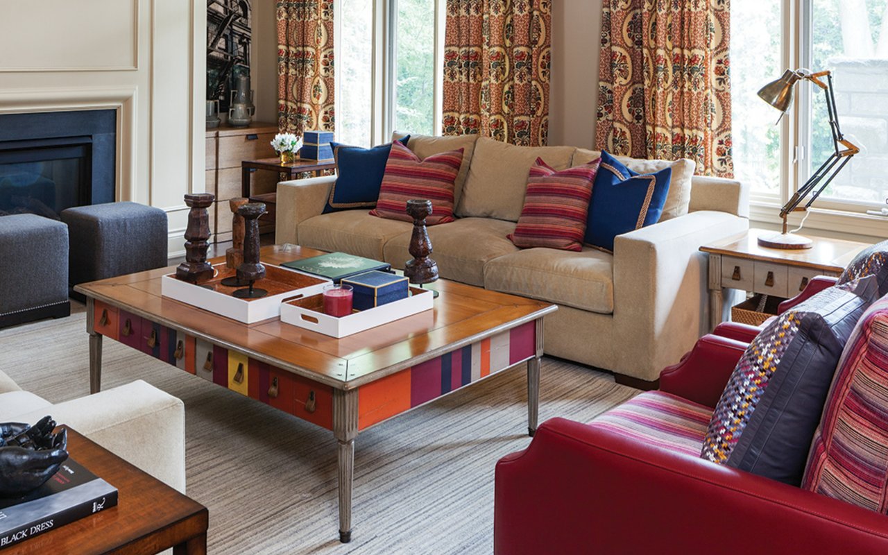
Orange, Red and Blue
Frequently a project begins with a piece of furniture the client already owns. That was the case with this colourful family room coffee table. When you start with a dramatic piece of furniture, there are two choices to make. Either you want the item to be the star of the room, in which case you’ll make everything else neutral, or you’ll create an environment where the dramatic item sets the tone. We opted for the latter solution in this family-friendly TV room by choosing a dynamic pallete of reds and blues for the draperies, the furnishings and the accessories.
The result: The whole family loves spending time here.
If you’re ready to breathe new life and personality into your neutral spaces, then you should really consider the mood or atmosphere you want to create before making a commitment to colour. Reds and oranges are high-energy colours. I use them sparingly to create impact in spaces, or liberally to create dynamic energy that is ideal for family rooms and play areas. Blues and greens are more soothing tones that can generally be used in abundance. However, keep contrast to a minimum in spaces where the goal is to create a quiet, restful environment. The most formal colour choice is black and white. Use this high contrast combination to create visual drama, ideal for entertaining spaces such as a living or dining room.
Remember, it takes very little colour to impact the visual atmosphere of a room that is built around neutrals. Consider colourful pillows on a gray or beige sofa, perhaps a throw draped across the arm of an off-white chair. Personally, I never met a colour I didn’t like. Except for mint green I have my reasons. Happy decorating.