First published in COLLECTIONS by Harvey Kalles Real Estate, Summer 2015
At the House of LMD, we love the colour white for many reasons. Its first impression evokes ethereal images, sensuality and purity; an all-white room provides an unmatchable sense of equanimity. It’s cool, serene and takes a certain level of confidence to pull it off. However, the reality of white is very different from the idea of it. It is an unforgiving colour and when it’s not done right, a room’s narrative can get blurred into one dimension or lost altogether. But when white is used in the best ways, there is nothing else like it.
Fashions Fade, Style is Eternal
Recently, I was commissioned to design a gorgeous Rosedale home in an all-white scheme. It was a chance to create subtle elegance throughout the space, and the result was breathtaking. White is a beautiful enigma: it is both the absence of colour and the accumulation of all colours. It has an incredibly strong presence because it provides such a stark contrast against everything else: nature, art, hardware or wood. It sets a lovely tone and creates the perfect backdrop, especially from an artistic perspective, which is why it’s often used in galleries. Decorating in all white remains a timeless style because it’s always in fashion. Just like theming spaces in black and white, in animal prints or in wood, white should not be viewed as solely a “colour” but as a style in and of itself. In this sense, it is able to span eras and trends.
Livability Perspective
White is often a dominant theme in modern galleries, retail boutiques, hotels and cool clubs, but due to the challenge of working with it in a livable space, it’s not as prevalent in our homes. You need to cross-balance the elements of practicality with design. The best way to do this is to reach for darker versions of white in the functional spaces, and use the most pristine, ethereal whites in safer places.
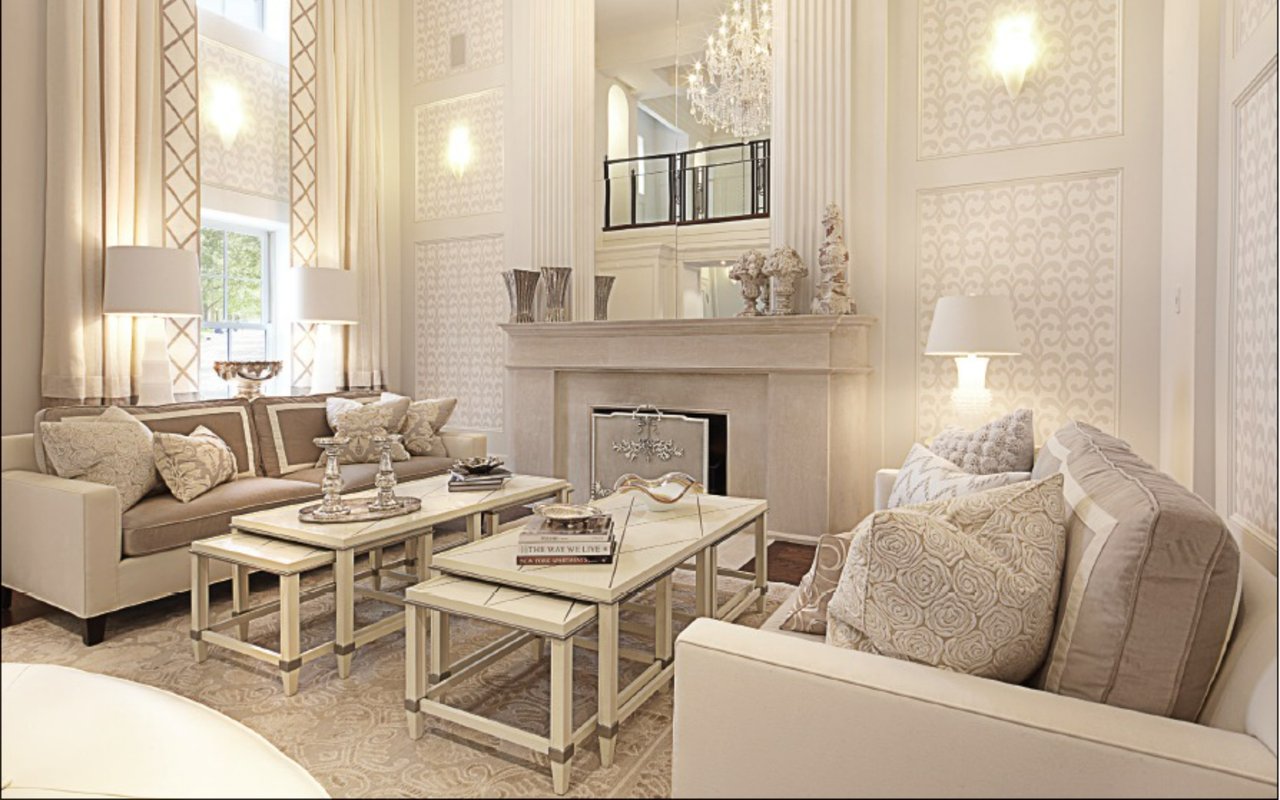
If you look closely at our Rosedale home’s living room, you will note that the sofas (where the homeowners actually sit) are upholstered in a soft gray with white trim. The change of colour is practical without losing any of the desired ethereal white effect. We’ve kept the feel of the white space throughout, while emphasizing practicality and function where needed.
Finishing Touches
Even the most opulent room in your home will likely be lived in. You need to note where the higher-use areas are and be very cognizant of the textures and finishes you choose when using white. If you sit on white fabric in your jeans, you are going to leave a mark — or if you grout a bathroom with white tiles, it will get dirty… that’s the reality. Fortunately, the high traffic areas can be made more lifestyle-friendly by selecting materials that will stand up to use. This could mean choosing leatherette over leather, a micro-velvet versus real velvet, or an epoxy grout instead of a real white grout where possible. Washable fabrics are also imperative if you’re going to include white in high traffic areas.
The White Palette
Using darker versions of white or incorporating grays is important. When you’re designing with a single colour, you must be careful that the room does not become one-dimensional. The key to designing in one colour is to utilize a palette of different layers; this creates interest and separation between the lines. The white palette is actually much larger than you might expect. It includes silvers, grays, golds and creams, but also brass, steel, fur and wool, ceramics, glass and wood.
In the dining room, I paired dark chocolate brown wood with white chairs and a high gloss table, creating a beautiful and classic framing effect that grounds the room. In the family room, I featured a striking gold chandelier, textured throw pillows, silver accents and patterned drapes. These colours are all in the same family, but they are different versions of white. By utilizing distinct textural surfaces that fall within this palette, you can create layers that keep your eye interested. If you’re only working with white on white on white, you’ll achieve that initial allure but you won’t have a continued narrative beyond your first impression.
Creating an Impact
Whenever you see white from a design perspective, it’s always an impactful colour, which is why we love working with it and why people love seeing it. Even in a foyer, you can create the perfect white canvas. In this home, I set a white, patterned carpet and decadent occasional chair against warm wood floors and a mirrored side table. We also marked the curvilinear staircase with a dark iron railing.
Whether you’re looking at a wedding gown, going to a beautiful beach house, visiting the white architecture of Greece or entering an all-white room, white has a remarkable ability to take our breath away. Regardless of what space you’re working with, incorporating both practicality and elegance will elevate your style while creating a home you can actually live in. Just remember, a successful interior is achieved by paying attention, not just to the big picture, but also to the details that set your design narrative apart. With the right combination of shade, texture and fabric, the panache of all white is as attainable in reality as it is in theory.